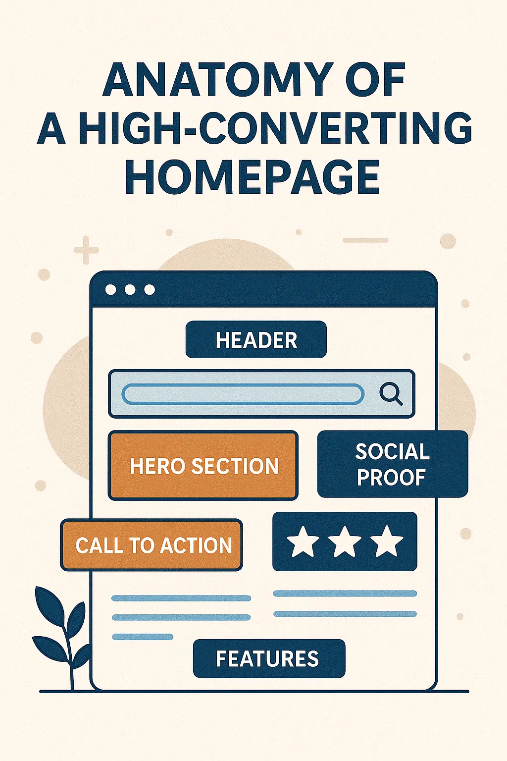
Anatomy of a High‑Converting Homepage: What Actually Works
Every homepage has one job: convert visitors into leads, customers, or engaged users. To do that consistently, the best homepages use specific structural and psychological elements. Below is a breakdown of what works — and why.
1. Clear Value Proposition & Headline Above the Fold
- Your headline should instantly convey what you do, who it’s for, and how it helps.
- This is often called the Unique Value Proposition (UVP). It stops visitors from bouncing by telling them they’ve landed in the right place.
- A supporting subheadline can add context or clarify the main benefit.
2. Primary Call to Action (CTA) That Pops & Repeats
- Place a strong, prominent CTA above the fold so visitors don’t have to scroll to act.
- Use contrast, whitespace, and design hierarchy so the CTA stands out.
- Repeat CTAs in logical places as users read further — but don’t overload the page with competing actions.
3. Visual Hierarchy & Clean Layout
- Use whitespace (negative space) to give breathing room around key elements, especially around CTAs.
- Guide the eye with visual flow — use size, contrast, and positioning to lead users through your message.
- Keep the design uncluttered to reduce decision fatigue and increase focus.
4. Benefits First, Features Later
- Focus your messaging on the outcomes and benefits your service or product delivers, not just features.
- Help visitors visualize how their life or business improves when they work with you.
- Put features deeper on the page or on linked sections for those who want details.
5. Trust & Credibility Signals
- Include testimonials, client logos, awards, or trust badges to reduce visitor anxiety.
- A few well-placed social proof elements can significantly increase conversions.
- Transparency in privacy, guarantees, or security seals also helps build trust.
6. Speed, Mobile-Friendly & Performance
- Fast load times are non-negotiable — slow sites drive visitors away.
- Ensure your homepage is fully responsive and adapts cleanly to mobile screens.
- Optimize images, scripts, and minimize code bloat to improve performance.
7. Intuitive Navigation & Logical Flow
- Use simple, predictable navigation to help users find what they want easily.
- Avoid too many menu options; focus on the key pages or paths you want users to follow.
- Use anchors or breadcrumbs if your homepage is long-form, so users can jump to sections.
8. Hero Section That Engages
- The hero section is the first visual and messaging experience a visitor sees.
- Use a strong background image or video, but keep performance in mind (optimize or lazy load).
- Combine your hero with a concise UVP, supporting line, and that above-the-fold CTA.
9. A/B Testing & Iteration
- No homepage is perfect from the start. Use A/B testing to try variants of headlines, visuals, CTAs, and layouts.
- Track metrics like bounce rate, click-through rate, and conversion funnels to see what works.
- Use a gradual visual intensity approach — too much flash can distract; too little may go unnoticed.
10. Structure & Suggested Content Flow
Here’s a common structure for a homepage that converts:
- Hero / Above-the-fold (Headline + Subheadline + CTA)
- Key benefits / “Why us” section
- Features or services with visual support
- Social proof / testimonials / trust badges
- Additional CTAs or next steps
- Footer with supporting links and contact info
Conclusion
A high-converting homepage combines clarity, trust, visual flow, and performance. You must immediately show visitors why they should stay, guide them to a primary action, and back up your claims with proof — all while keeping the experience smooth and fast. With testing and thoughtful structure, your homepage can become a conversion engine rather than a passive welcome mat.